Cotswolds

Cotswolds
Cotswolds

Lake District

Lake District
Lake District

Ireland

Ireland
Ireland

Recently Read

I realised recently that it's been absolutely aaages since I did a book post!! I suppose it's just been down to the fact I haven't had as much time for reading in the last few months so I'm not really getting through books the same way I was this time last year, which is a shame. Thankfully my life is starting to get a little less busy now with my Year Abroad paperwork all done and university (albeit in Spain) back in full swing, so I'm looking forward to having a lot more reading time.

Would you believe I only managed to conquer two books this summer, one of which I absolutely loved; the other, not so much...


Far from the Madding Crowd by Thomas Hardy

She was of the stuff of which great men's mothers are made. She was indispensable to high generation, feared at tea-parties, hated in shops, and loved at crises. 

As I've mentioned on my blog before, this was the first Thomas Hardy novel I've ever read and I completely adored it. The novel tells the tale of Bathsheba Everdene, a beautiful and spirited young woman who inherits a farm and small fortune from her uncle following his death. Soon after arriving in the town of Weatherby, where she has gone to assume her place as the estate's sole proprietor, she attracts the attention of three men of very different stature who all set about trying to pursue her.

I think the thing I love most about classic British literature is the way it allows you to escape to a different time and place. I'm sure everyone knows by now that I am absolutely mad about the British countryside, so the county of Wessex that Hardy describes, full of sweeping green hills, forests, and ocean, really appealed to the anglophile in me. His engaging use of sensory description also really allowed me to picture every shifting and varied rural scene in incredible detail, which I loved.

Bathsheba herself has taken a firm place among my favourite literary characters of all time. Despite an unflappable exterior (and a pretty face), she is infinitely flawed; as are all of the characters in this book. However, it was these flaws in part that endeared me to her. Watching her battle to overcome the hurdles of her position not only as a female landowner, but a very young one (I think she's around 20 years old at the beginning of the novel), was as fascinating a story as any romance in this book and she is definitely a force to be reckoned with if there ever was one.

I know English classics are not to everyone's taste, but if you've ever thought you might like to give some classic literature a go, I feel like this book is a good place to start, especially if you need a bit of an escape. Rating: 


Gone Girl by Gillian Flynn

People say children from broken homes have it hard, but the children of charmed marriages have their own particular challenges.
I finally got around to reading 'Gone Girl' after featuring it in my December/January Book and Poetry Haul, so I think it goes without saying that it wasn't particularly far up my reading list. 

For those who may be unfamiliar with the plot of 'Gone Girl', it's the story of a couple who from the outside appear to have the perfect marriage. Nick is a handsome and charismatic young writer and Amy, his beautiful and captivating wife, has long been known and loved by the public as the subject of a popular series of children's books, 'Amazing Amy'. However, when Amy mysteriously disappears on their fifth wedding anniversary- apparently the victim of a kidnapping or worse; murder- the subsequent police investigation brings the true cracks in Nick and Amy's marriage to light, with all evidence from Amy's disappearance pointing in Nick's direction.

Obviously there's been a huge amount of hype surrounding this book, especially with all the buzz the movie adaptation created last year, but I have to say, I just wasn't a fan of it. I didn't find it to be a pleasant or particularly engaging read in any way, and I definitely would not describe it as "addictive" as the front cover so claims. It's a thriller, and I suppose thrillers will always sell well, and I will admit I did keep reading on to find out how the Amy mystery would unfold, but by the end I was left feeling vaguely dissatisfied with a bad taste in my mouth.

I've heard this book being criticised over and over again by people who claim their main issue with the book is that none of the characters are particularly likeable, and I definitely agree, though in Flynn's defence, I don't think they were ever meant to be. In any case, the fact that so many of the characters were so horrible just didn't make for an enjoyable read for me, nor did the fact that the plotline just kept getting more and more ridiculous and the characters more and more like garish caricatures and genre clichés as the story went on.

That being said, I thought the writing itself was good and a lot of the imagery was very original but I just found some parts of the book so, so vulgar and crude. I feel like there's a fine line between trying to create dramatic impact and just trying to elicit a cheap shock out of your readers for the sake of it, and I don't feel like Gillian Flynn really knows the difference. In any case, for me it took away from the novel rather than added to it.

I'm really sorry to any diehard 'Gone Girl' fans who might be reading this, maybe it just wasn't to my taste, and I definitely didn't hate it, but I don't think I'll be in a rush to reread it any time soon! Rating: 

Again, I hope I haven't offended anyone with that kind of harsh review. In fairness, 'Far from the Madding Crowd' was always going to be a difficult book to follow because I just loved it so much!

What have you been reading recently?

Tutorial | Designing a Blog Header with Picmonkey

Following one of my previous posts, 10 Easy Ways to Make the Most Out of a Default Blogger Template, I received a few requests asking if I would explain the process of how I make blog headers in a bit more detail. I do the vast majority of this kind of work on Photoshop now but before I had that I used to use a combination of Picmonkey and Pixlr, two online image editing tools, both of which essentially do the same job as Photoshop but without some of the more complicated features and extras. Picmonkey in particular is ridiculously easy to use and is extremely user-friendly so I thought I'd write up a tutorial on how you can use it to put your header together.

Before I begin I jut wanted to clarify that I'm not a graphic designer or illustrator by any means (any attempt I'd ever make at drawing up a header from scratch would just be awful), so this tutorial will just be a simple breakdown of the technical side of combining different elements together to create a brandable image; a much more accessible approach for those of us who aren't particularly artistically gifted.

A quick note on that though: it's really important that you respect copyrights on other people's work and make sure you read the licensing information on any image you wish use that you didn't create yourself. Not only could you find yourself in hot water by using images without the owner's permission, but it's also just not very nice. More on that later...

For now, here's how you (a mere mortal with limited artistic/creative ability) can put together a decent blog header...

1. Gather up your resources


Fonts

One good thing about Picmonkey is that you're able to access and use the fonts you've downloaded to your computer. However, sometimes it can take a while for them to transfer across and you may have to restart your browser or just wait for a bit after installing a new font.

There are a few different sites where you can download fonts for use on your design. The vast majority of these are free for personal use only. You may also find a few that free for commercial use too but they're quite often few and far between. Generally, to use a font on your blog (that isn't already free for commercial use) you'll have to purchase a commercial license. The cost of a commercial license for a font can vary drastically but you'll still find many around the US$5-10 bracket (around £3-6). 

Before I start a design project I normally go through and download any fonts I feel would be suitable for the 'look' I want to go for. I then try them out with my design to try and find the one that works the best. If I know the font is free for commercial use, great! If not, I go and find out how much a commercial license costs for that font. If it's affordable, I'll buy it, if not I'll normally just try something else. I don't know if this is necessarily the most efficient method but I feel like having a few different fonts to play around with initially helps me decide what sort of thing looks best for what I'm working on.

A few places where you can pick up fonts:

Font Squirrel: This isn't a hugely extensive database but all of the fonts listed here are free for commercial use. It's such a godsend of a resource!
How to check the licensing details: If you want a bit more information on the specifics of the font license, click on the font you want to use and then click on the 'license' tab on the page that appears.

1001 fonts: My personal favourite because it allows you to sample a snippet of text in each font.
How to check the licensing details: Hover over the price tag symbol to the right of the font and click for further information.

DaFont: Another good resource with some 28,000 fonts for your perusal.
How to check the licensing details: Click on the font you wish to use and their should be a 'note from the author' underneath the font sample on the page that appears.

Pickmonkey fonts: As far as I know, some of the fonts provided on Picmonkey are free for commercial use and others are not so make sure you check before you use any of them.


Graphics

You may want to just have a text header, in which case don't worry about this step! But sometimes it can be nice to incorporate some graphics into your header.

I buy all of the graphics I use for custom headers on Etsy. While there are still other places you can buy images, for example Creative Market, I have yet to find a cheaper resource for high quality graphics and illustrations. On Etsy there is an absolute multitude of artists selling their work as clipart along with a commercial license for just a few pounds.


One pitfall of buying graphic packs from Etsy stores is the fact that the graphic you buy isn't unique in the sense that it's being sold multiple times to multiple people who can then also use it for their own purposes. However, so long as that doesn't bother you, it's a very inexpensive way to brighten up your blog header compared to the alternative of commissioning an artist to create an image from scratch.

Again, make sure you check the Etsy store's policies and read their licensing rules before using their images! Even if you've paid for them, stores can sometimes have extended licenses you'll need to purchase to use the image in a commercial context.


2. Prepping your canvas


Sizing your canvas

First things first, on the homepage of Picmonkey, click on 'Design' which will take you into the design area. I start all my headers on a canvas that's 900px (w) x 400px (h) and that seems to work well for Blogger. The width is the most important thing here, I always end up cropping my height down at the end anyway but having those extra few hundred pixels gives you a bit more room to work with.

To resize your canvas, click on the square 'crop' symbol at the top of the bar on the far left which will take you to 'Basic Edits' and scroll down to 'Resize'. Make sure you un-tick 'Keep proportions' before you type in your dimensions, and then click 'Apply' to make your changes.


Creating a transparent background

I always make header backgrounds transparent. I just think it makes them so much easier to work with since you can then put them against any backdrop without a huge white bar getting in the way. Furthermore, if there ever comes a time when you want your header image to have a white background, you can just simply overlay the transparent image onto a white canvas and save it as another file and that's you sorted!

To make your canvas transparent on Picmonkey go to 'basic edits' - or the crop icon at the top of the menu- click on 'Canvas color' and tick 'Transparent canvas'.


3. Adding Text

I've now chosen the font I want to use, I've downloaded it and installed it onto my computer. The next step is to add it to my design. On the left sidebar on Picmonkey again click on the 'Text' tool- that's the icon with the upper- and lower-case 'T's- and find the font you want. You can switch between Picmonkey's own ready-installed fonts and your own fonts by clicking on the 'Ours' and 'Yours' tabs at the top. When you've selected your font click 'Add Text' and type in your blog's title. 


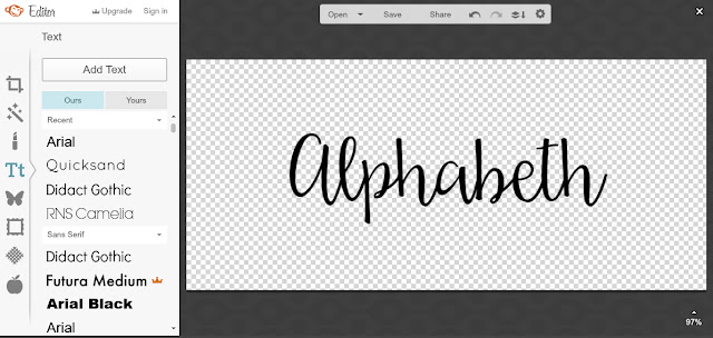
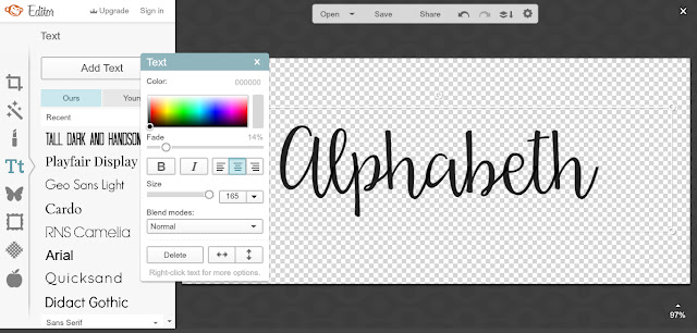
When you select your text a toolbar will appear that allows you to make adjustments. You can change your text's size either by pulling the 'size' bar across on the toolbar or by manually resizing the frame your text is contained in. You can also change your text's colour via the colour spectrum at the top. The arrows in the bottom right-hand corner will flip your text horizontally or vertically, the 'Blend modes' are premade format settings and the 'Fade' option edits your text's opacity. I usually fade my text out a little bit when I'm editing on Picmonkey to make it a little bit softer, especially if it's black. I also like the effect it creates but it's just a stylistic preference really.

4. Adding a Tagline

I've included the first image below to give an example what not to do! If you've used a cursive or decorative font for your blog title it's always best to use a much simpler serif font (like Times New Roman or Georgia) or sans serif font (like Arial or Tahoma) for your tagline, otherwise there's just a bit too much going on and the main focal point of your header is lost. The text in the example below also isn't aligned very well which is making the header look a bit unbalanced and lopsided.

As a general rule, it's a good idea to pair different font styles as a means of creating contrast (contrast is good!). So, if you're using a serif font for your header text, it might be nice to pair it with a sans serif font for your tagline or vice versa. I found an excellent pin with some rules for combining fonts here!


As you can see in the example below, I've changed the tagline to a serif font to contrast with my cursive header text. I also found that my tagline fitted nice and snug in between the dips in the 'p' and 'h', making the overall design look a bit tidier.

I've temporarily changed the canvas colour back to white so I can gauge the spacing a little bit better and get a better idea of what my header will look like against a white background, but I'll change this back at the end.


5. Adding Images

In the screenshot below I've bought some individual watercolour flowers from Etsy to place around my text. 

To add images to your header click on the butterfly icon in the sidebar which will take you to the 'Overlays' section. Here, Picmonkey has loads of its own graphics which you can definitely incorporate into your design if you'd like to. To add one of your own images though, click on 'Your Own' and select the image you want. Your overlays can then be edited and altered in the same way as your text.


The idea when adding graphics is to adorn your header without interfering with or obscuring the text in any way, since the most important thing is that your text is easily read! To prevent my flowers from getting in the way I've arranged the layers of my image so that the flowers have been sent to the back (apart from that one flower on the right-hand side which I've brought to the front to create a bit of depth). By adding the flowers at opposite ends of the header, again, it's helped to balance out the image.

To arrange your image's layers, right click on the layer you want to position or arrange and you'll have the option to 'Send to back' which will send the layer to the very back of the image, 'Send backward', which will send it a layer backwards, 'Bring forward' which will bring it a layer forwards and 'Bring to front' which will send the layer to the very front of the image. 

It's worth noting another option on this list 'Duplicate layer' which allows you to duplicate a layer onto your canvas without having to re-import it from your computer.


6. Final Tweaks

Design in general involves a lot of trial and error so don't be afraid to play around and try different things. For example, once I had my flowers added in, I didn't feel as though they worked amazingly well with my tagline font. The font was a little bit too formal and a little bit too heavy with all of the elements involved in my header so I decided to change it to something a bit lighter, as you can see in the image below.


At this stage, another good way to create contrast between your header and tagline is to play around with colour. In the example below I've changed my tagline text to a colour that complements the images I've used, and I actually really like the end result!

Also, as I said previously, I only changed my canvas colour back to white temporarily. If you do this make sure you change it back to transparent before you save it!


Before I save my image I also want to crop off the excess height, since this will just appear as unnecessary padding on my blog, though I still want to keep the width the same. To crop your image, go back to 'Basic Edits' and click on 'Crop', then selected the area you wish to crop down to and click 'Apply'.


7. Save your image

Finally, when you're happy with the header you've created, hit 'Save' at the top of your page. When you're saving your image, make sure you save it in a PNG format by selecting this option in the drop-down menu. This will preserve your header's transparency. 

And you're done! If you need it, you can find some more information about installing a header onto a Blogger blog here.


I know not everyone will benefit from this tutorial but I hope at least a few people find it helpful. As you can see I actually ended up liking this header so much I've permanently adopted it, which was a bit unexpected! I hope you like the end product, I feel like it's a nice change.

If you have any more questions please feel free to leave them in the comments, or tweet me @alphabethblog!

Exploring a Cloudy Bilbao | Year Abroad

Tomorrow will mark the beginning of my third week in Bilbao. It's a beautiful city and one that's fairly close to my heart since it was here that I got my very first taste of mainland Spain when I worked as an au pair for a family in the Basque Country in the summer of 2013. My first ever post on this blog was actually about my experience of working as an au pair which you can read here.

The Basque Country is actually also the place where the idea for my blog was initially conceived. I spent the most part of my time as an au pair at the family's holiday home, which was at the top of a mountain in a little coastal town with no WiFi. As it turned out, three weeks of internet deprivation along with a lot of time to think and fantasise about all the things I'd do on my return to "civilisation" resulted in me deciding that I wanted to start a blog. In my mind it would be a totally cool, edgy fashion blog; I literally have no idea why I thought this was me or I could pull that off. I guess it was the influence of a few occasional trips into the city and that 18-year-old-fresh-outta-school "I can do anything" mentality (I also decided I'd start collecting old rock vinyls and wearing all leather). None of these things actually happened- probably for the best, I'd say- and as you can see, Alphabeth went in a completely different direction. Nevertheless, it was still very cool to stand in the centre of Bilbao, camera in hand, and reflect on how much has changed and progressed since the last time I was here.


I'd love to say that I've been having an unbelievable time here so far, but in truth, I'm still adjusting. Moving to Spain has been a lot more of a culture shock than I, for some reason, had expected. And, while living here in Bilbao has been a vast improvement on the time I spent in Andalucía- for one, there are an abundance of students and people my own age, and I'm living with two other Irish girls!- it's still hard trying to get into the hang of things like the weird shop opening hours and the fact that Bilbao completely shuts down on a Sunday (this is kind of a blessing in disguise since you can essentially do absolutely nothing beyond watching Netflix in your PJs and not feel the least bit guilty! However, that's provided you've made sure you're not in dire need of anything before the shops close on Saturday night).

Anyone who knows me well could tell you how much I love the British/Irish landscape, though I'm sure that's something you can also probably tell from my usual blog content, and it's definitely one of the things I miss the most about UK- that, and not having access to my daily staple of Heinz Cream of Chicken Soup! The north of Spain is beautiful and green, and it's certainly a lot more familiar than the dry southern coast, but it's not home. That being said, I'm confident that things will get better with time, as they always do. I remember feeling much the same when I first moved over to uni. Believe it or not, I even found England a bit foreign at first.

My three housemates are all off on various travels this weekend so I've had our flat and some time to myself. I had to go into Bilbao Centre to pick up a few things yesterday and decided to bring my camera with me to try and capture a bit of Bilbao and give you lot a bit of an introduction to the city since this is only the beginning of what will be a year of many Spain- and Bilbao-orientated posts.


It was very overcast yesterday which was a shame since it had been beautiful the day before! All these pictures were taken on my circuit around town and back home, the first few in and around Bilbao's main shopping area and financial capital, Gran Vía and then Plaza Federico Moyúa, a well-known square at the end of Gran Vía that contains a beautiful fountain and some gorgeous French-style flowerbeds. Bilbao has unbelievable shopping, something which I don't think is going to be very good for my bank balance this coming year! I've never lived in a proper city before (even Belfast isn't quite a "proper" big city in the grand scheme of things) so it's an amazing novelty to have all the shopping you could ever need literally less than a mile from my doorstep. Even within my own neighbourhood I don't have to go very far to pick up essentials. Within a 2 minute walk from my flat there's a fruit shop, a pharmacy, a butchers, a bakers, bars, cafes and two supermarkets. It makes a huge change from living in Lancaster or where I live in Northern Ireland and having to walk 15-20 minutes just to get to the nearest garage or Tesco Express.


On the way home I passed the Guggenheim Museum. This kind of epitomises everything I love about Bilbao in the sense that the city is such an eclectic mix of old and new, even near-futuristic-style, architecture. On one side of the city you've got the Casco Viejo, the 'Old Town' with its narrow streets and tall balconied townhouses and then just across the river you find places like the Guggenheim, which is like nothing I've ever really seen before. Bilbao's Guggenheim is one of several museums owned all over the world by the Solomon R. Guggenheim Foundation, all of which house various pieces of modern and contemporary art. I haven't been inside properly yet, I've just wandered briefly through the foyer but I'm really keen to go as soon as possible.

At the front of the building there sits a 43ft tall sculpture of a West Highland Terrier known as 'Puppy'. It was designed by Jeff Koons in 1992 and is made of a metal structure which supports tens of thousands of fresh flowers (I've read 36,000 flowers from one source and 70,000 from another so I'm not sure how many it actually is!) which form the sculpture's façade. I think it's absolutely beautiful and is all the more awe-inspiring in real life! Inside the sculpture there's an internal irrigation system and the flowers are replaced seasonally in May and October so the sculpture can be seen to change colour throughout the year.


As much as I love the Puppy, in my opinion the back of the Guggenheim is even more impressive than its front, if that's possible! The rear of the building backs onto the River Nervion and I feel like it's from this angle that the curved exterior of the building, which is coated in glass and titanium, is the most striking. This is the side I pass from across the river on my walk to university every morning and it never fails to turn my head!

There are a few sculptures aside from the puppy that are dotted around the outside of the museum. The sculpture comprising a series of stacked metal spheres pictured above is called 'Tall Tree and the Eye' and is by Indian artist, Anish Kapoor. There's also another Jeff Koons piece called 'Tulips' that you can just about make out on the platform protruding over the water in the photo above. It's a giant bouquet of multicoloured flowers made out of stainless steel that was part of Koons's 'Celebration' collection where he painted and sculpted items that are generally mass-produced in association with birthdays and holidays.


Finally, probably among the most iconic images of Bilbao in my mind is the huge and somewhat curious 30ft high spider sculpture, Maman by Louise Bourgeois that also sits at the rear of the Guggenheim. It's constructed from bronze, stainless steel, and marble and while it's undoubtedly very interesting, I can imagine it being an arachnophobic's worse nightmare. I'm not hugely afraid of spiders but this sculpture still makes me feel a bit uneasy. I think its a combination of the spindly legs and the sac of marble eggs contained in the spider's abdomen. However, I'm actually still very fond of it, especially what it represents.

The sculpture is an ode to the artist's mother who died when Bourgeois was 21 years old. Despite what it may seem this is a flattering comparison, with the spider symbolising aspects of her mother's character such as care, and protection. It's also meant to encompass the idea of spinning and weaving, alluding to her mother's role in repairing tapestries in her father's textile restoration workshop.

What did you get up to this weekend?
Powered by Blogger.